Problem Statement
How might we bridge the gap between Designers and Product teams, to provide better recommendations, resources, and tracking in proximity to where most design decisions are being made (Figma!).
Assumptions
Product designers create assumptions at the start of a design project to identify what they believe to be true about users, needs, or behaviors. These assumptions guide early decisions and help prioritize what should be tested, validated, or challenged through research.
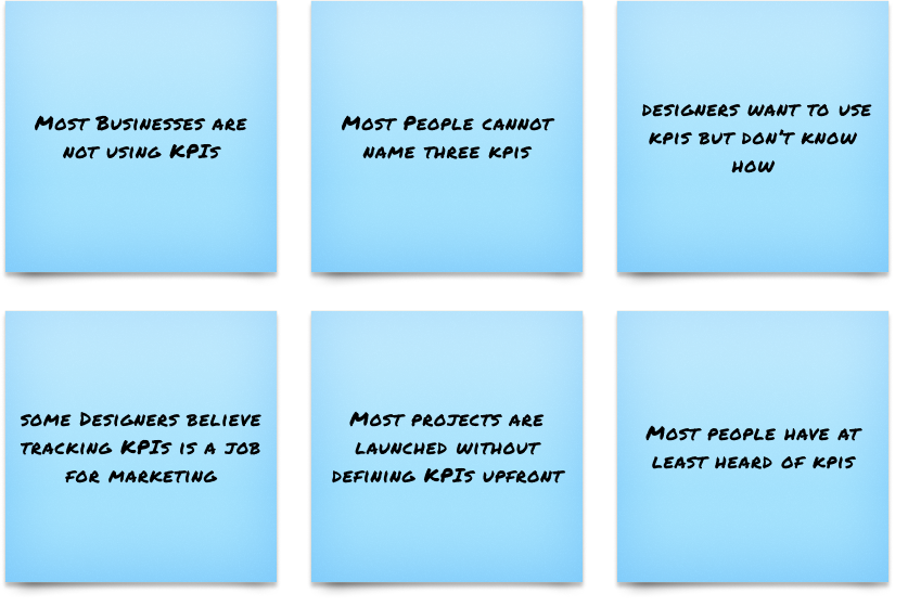
User Interviews
We interviewed 10 product designers, managers, and engineers in an initial need-finding research phase to learn about perceptions towards and usage of KPIs in product design.
Our insights can be condensed into this:
Designers and product teams are likely to use a simple, visual KPI tool that provides guided KPI discovery (without prior knowledge) while serving as an in-project reference.

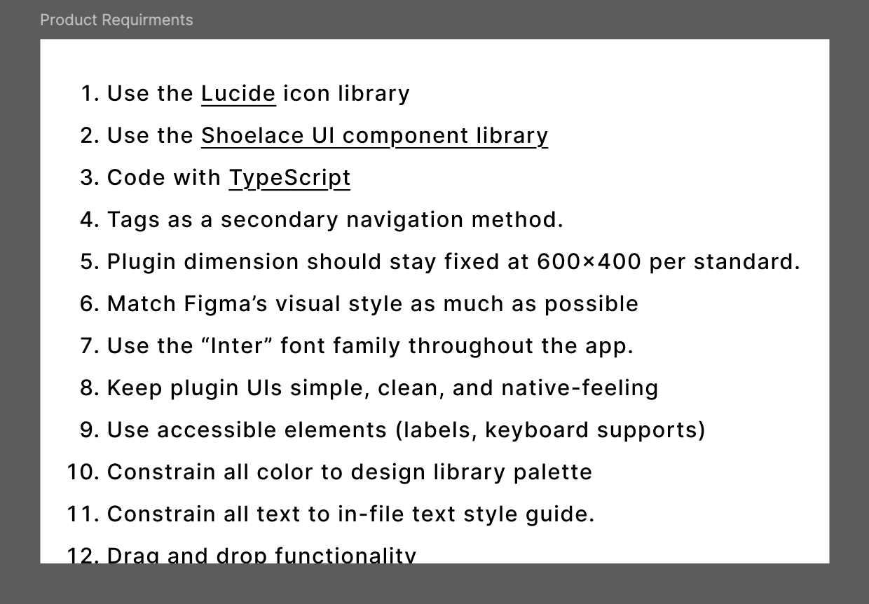
Product Requirements
Working from a Product Requirement Document (PRD) was key to keeping the project focused and aligned. It helped clearly define desired functionalities, guide scope decisions, and ensure everyone—from design to development—was building toward the same goals.
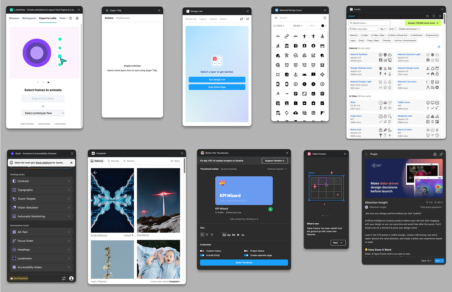
Competitor Analysis
We reviewed a range of existing Figma plugins—each with different layouts, flows, and UI styles—to understand common patterns. This helped us design a plugin that felt familiar and intuitive, aligning with user expectations while still standing out with our unique functionality.
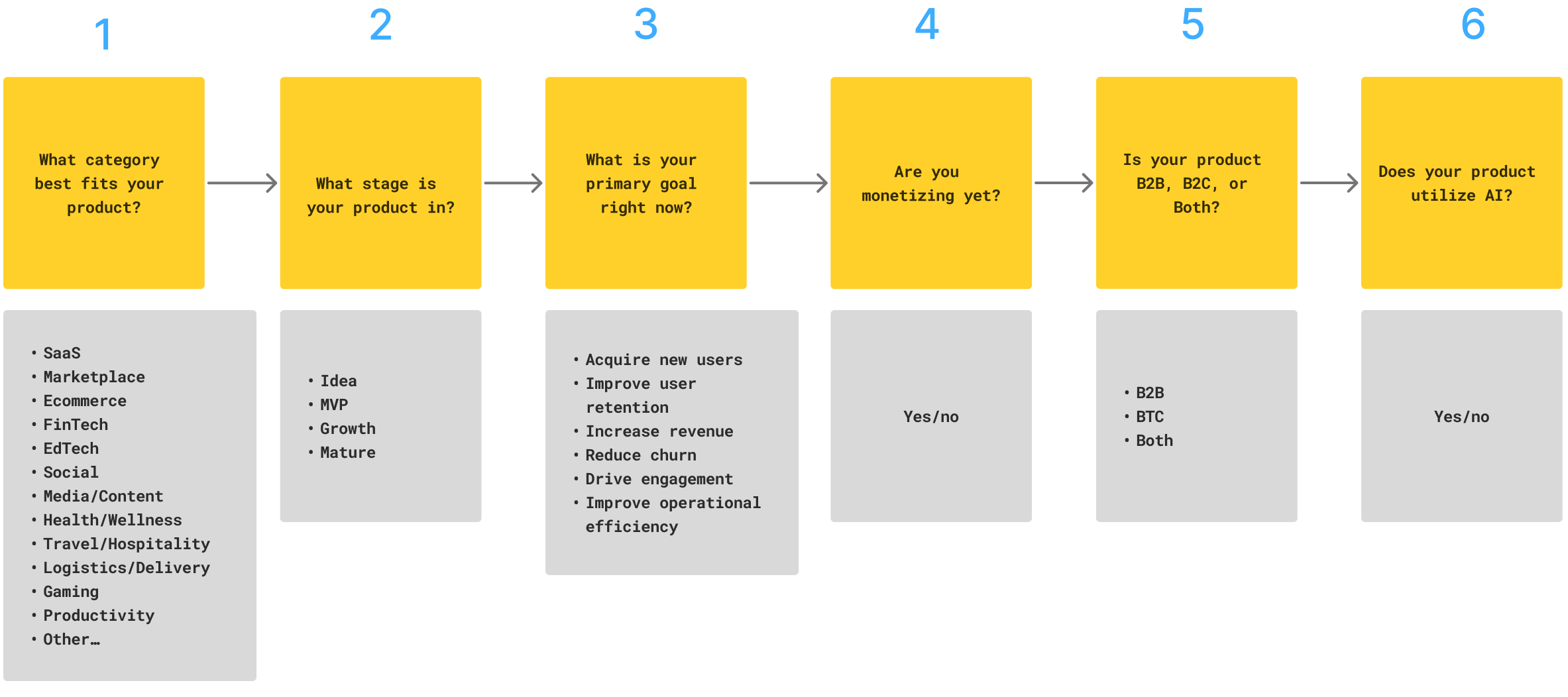
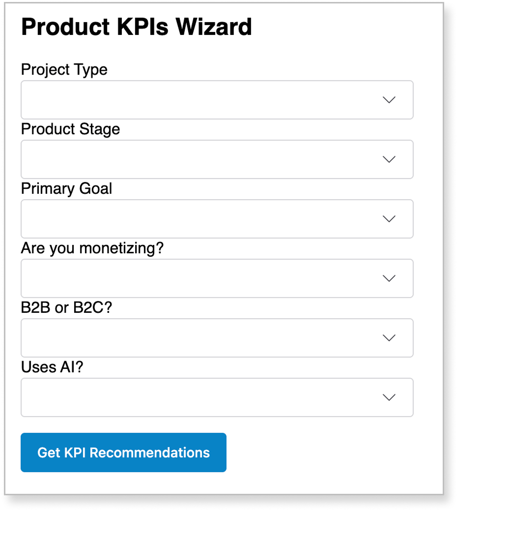
Six Key Questions
We focused on asking the right six questions in the wizard to deliver the most accurate KPI recommendations. Through testing, we found that six was the sweet spot—enough context for smart results, without triggering drop-off.
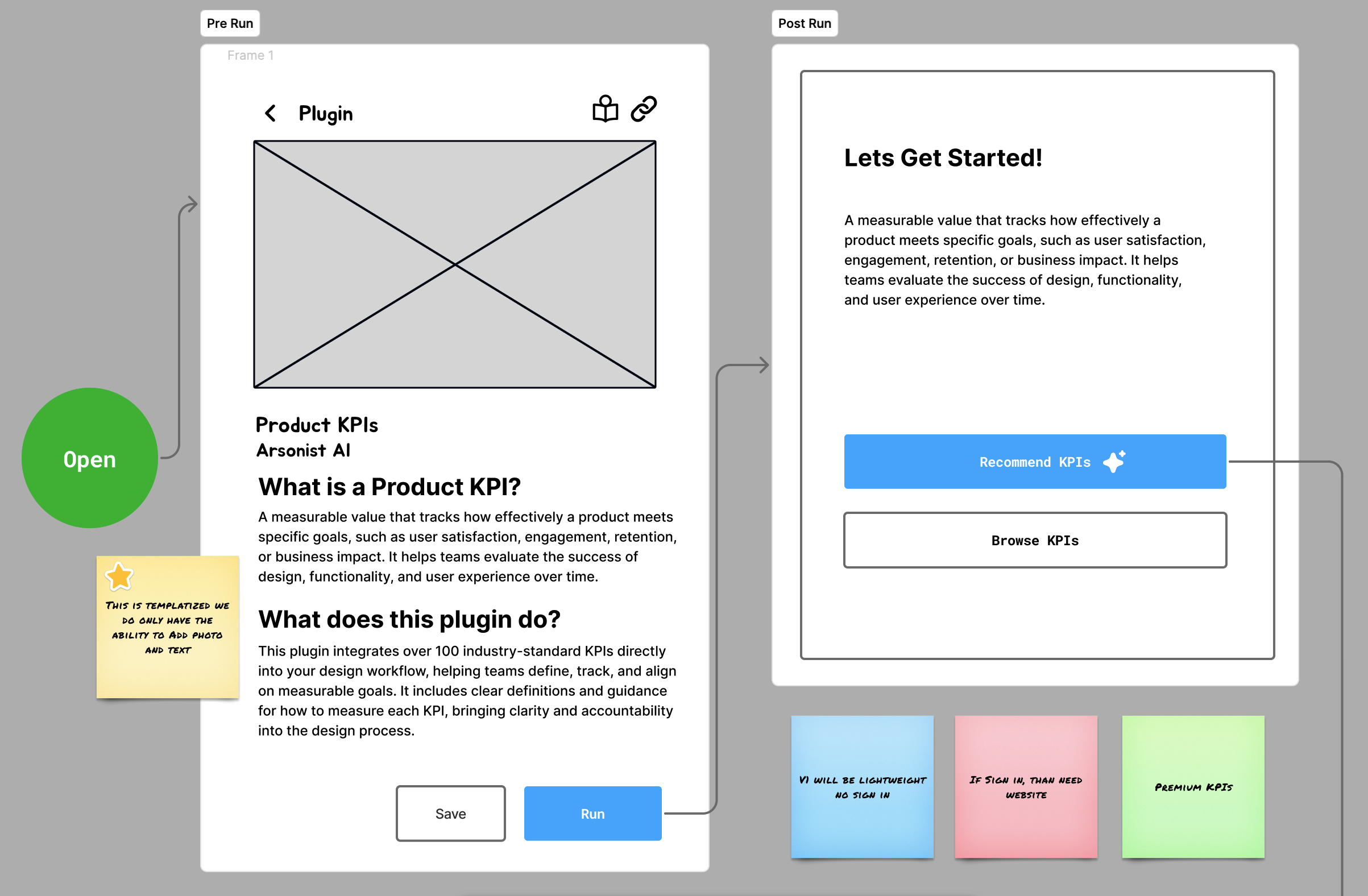
Wireframing
We used wireframes to quickly explore layout and interaction ideas at a low fidelity, helping us iterate rapidly. These early concepts were shown to users to validate flows and gather feedback before investing time in detailed, pixel-perfect mockups.
Vibe Coding in Vercel and Lovable
Vibe coding was an impressive way to spark creative thinking at the project outset because it allows for rapid, unstructured exploration without overthinking structure or fidelity. However, since this project was a Figma plugin with strict best practices, it wasn’t suitable for building the final solution.
Short vs Long Form
We tested both single-page forms—which are commonly used in workplace settings due to their efficiency—but ultimately moved forward with a multi-page, wizard-style flow. Usability testing showed a clear preference for the wizard format, as users found it more digestible and less cognitively overwhelming. By breaking the process into smaller, focused steps, the flow felt more manageable, which in turn incentivized users to complete it.
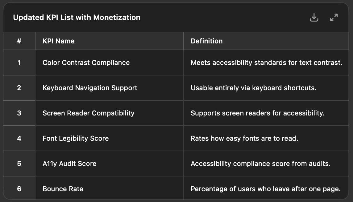
AI Data Preprocessing
We used AI to generate initial data for the KPIs, which taught us a lot about prompt engineering—how to phrase inputs to get reliable results. We also had to work through problems and limitations, including occasional inaccuracies and hallucinations, highlighting the importance of human review and iteration.
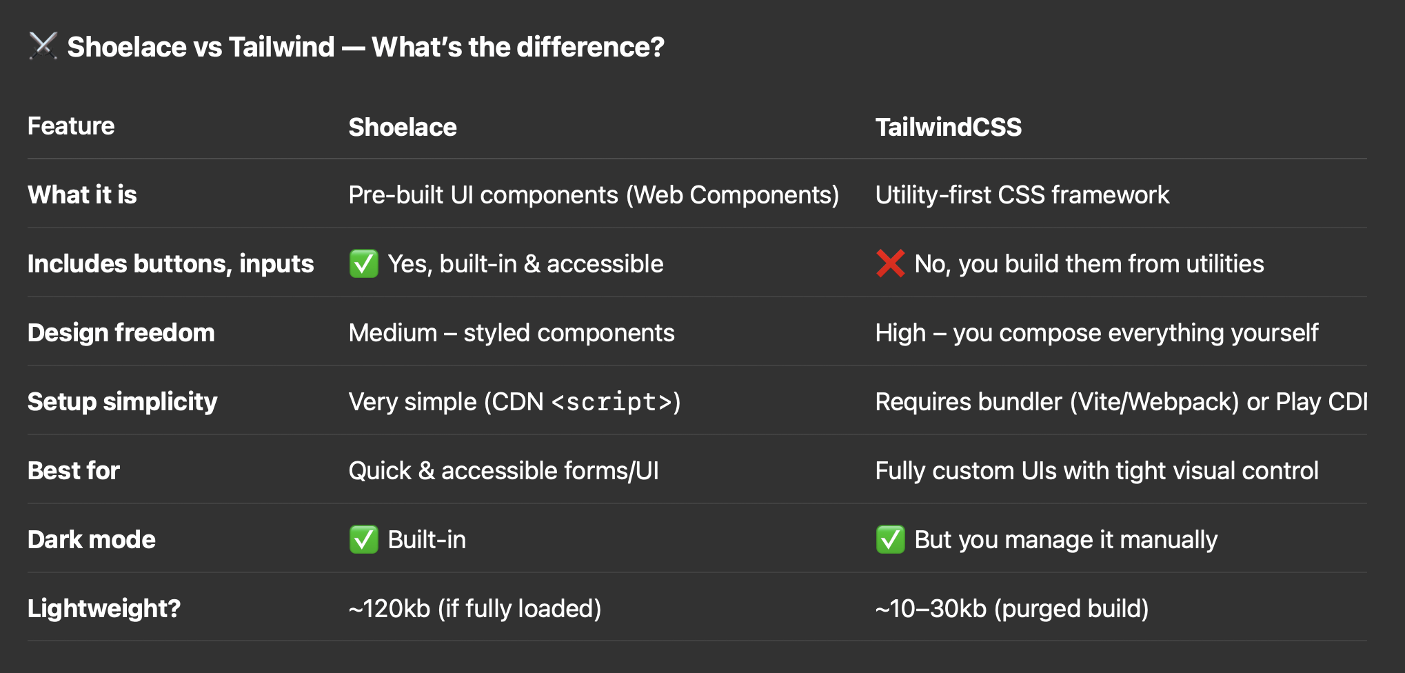
Using AI to Select the Ideal Web Component Library
We used AI to evaluate web component libraries based on setup ease, accessibility, and visual flexibility. Shoelace emerged as the ideal choice, offering a balance of clean design defaults and customization without framework lock-in—perfect for rapid plugin UI development.
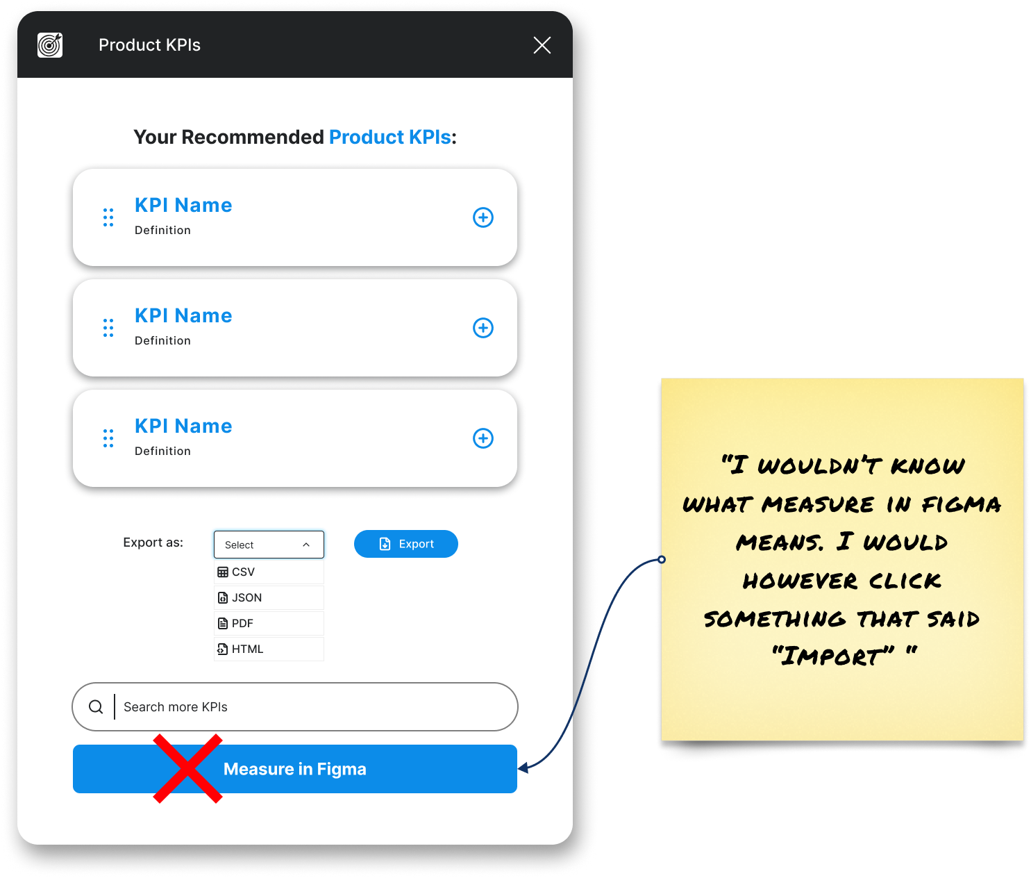
Implementing User Feedback
During user interviews, we shared interactive prototypes to gather direct feedback on the design’s look, feel, functionality, and copy. This hands-on approach helped us quickly identify what resonated, what felt confusing, and how to improve clarity and overall experience.
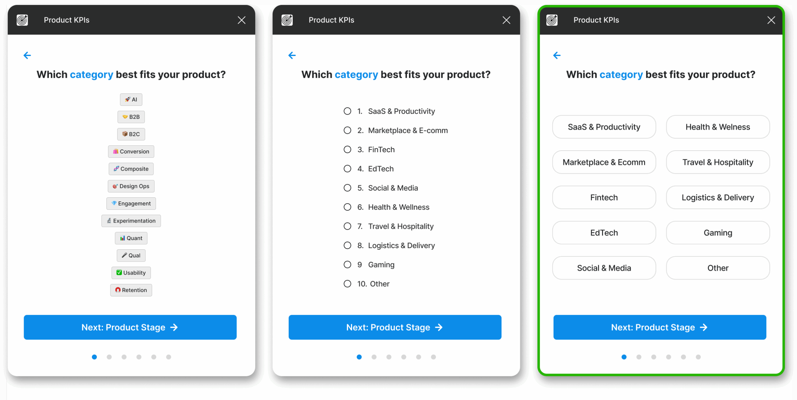
Choosing between Selection Input Types
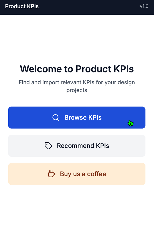
We explored a variety of selection inputs including radio buttons, tags, and button-based selectors to guide user input. Ultimately, we chose buttons based on user preference—they felt more intuitive and visually engaging. Buttons also aligned better with the rest of our flow, maintaining consistency and clarity.
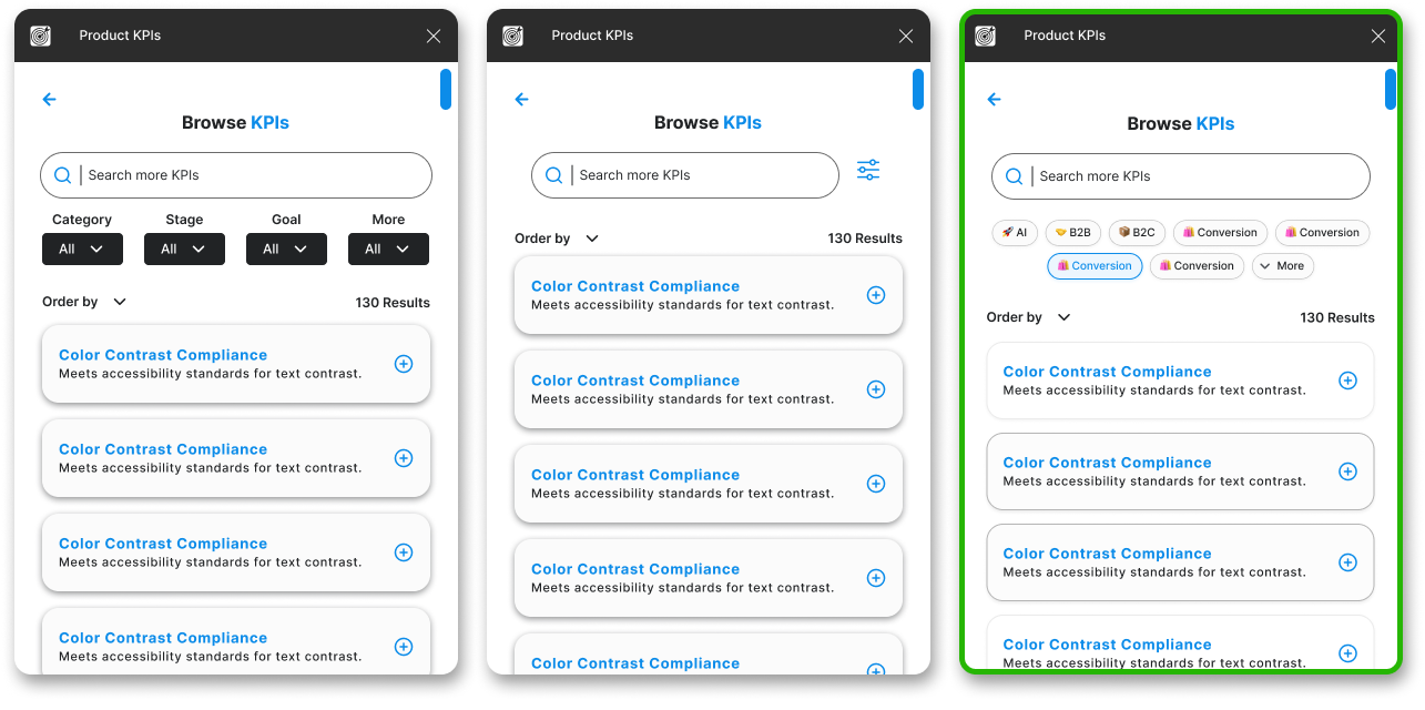
Browse Filters vs Tags
We tested both traditional dropdown-style filters and newer "interest-style" tags to guide user input on the Browse page. Users consistently preferred tags, describing them as more visual, interactive, and engaging.
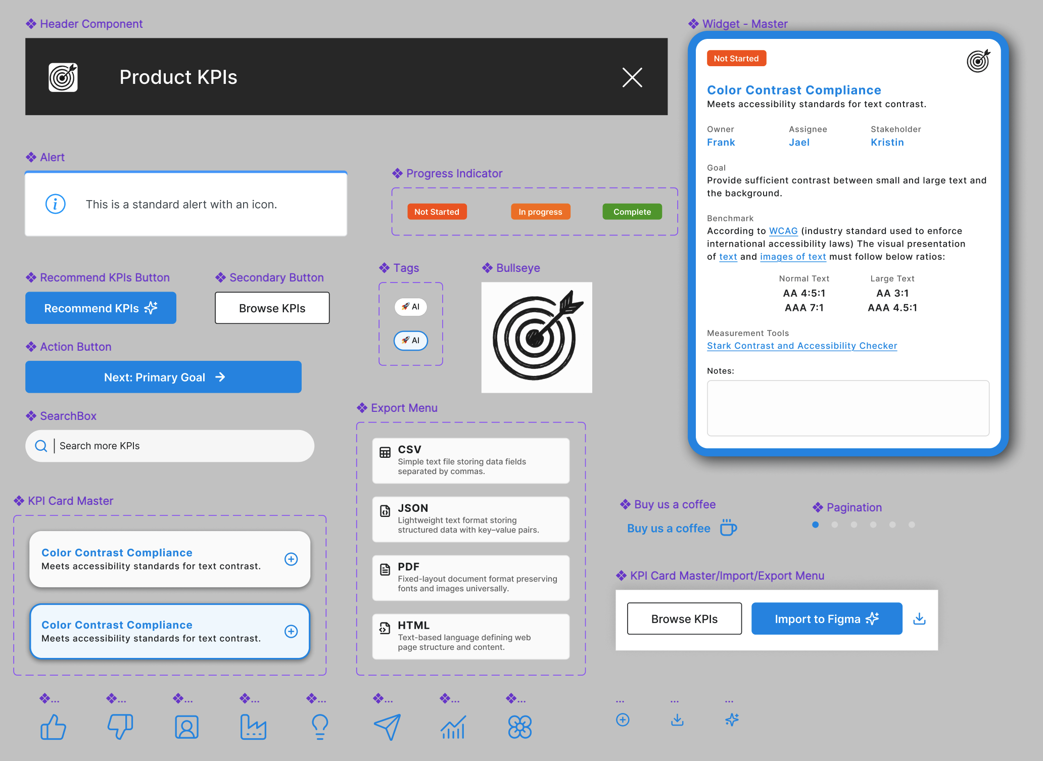
Component Library
We leveraged Figma components to maintain consistency across screens and speed up design updates. Reusable elements allowed us to scale quickly, reduce duplication, and ensure our mockups stayed aligned with development needs for smooth code export.
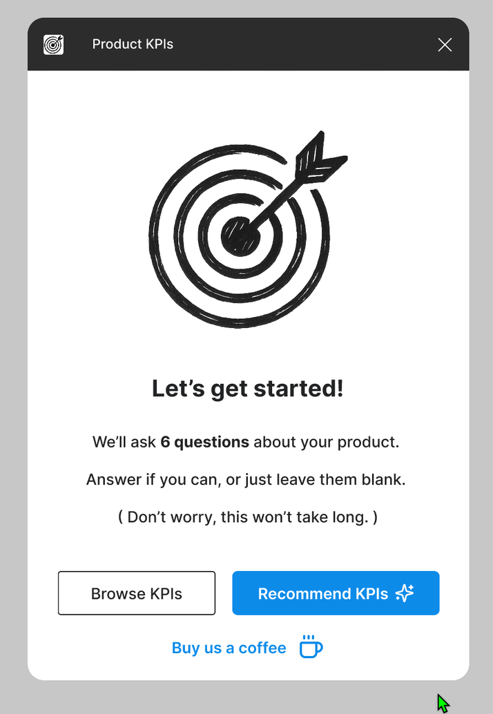
Figma Prototype
These high-fidelity prototypes allow us to test interactions, gather user feedback, and ensure clear alignment with development. They bridge design and functionality, reducing ambiguity.
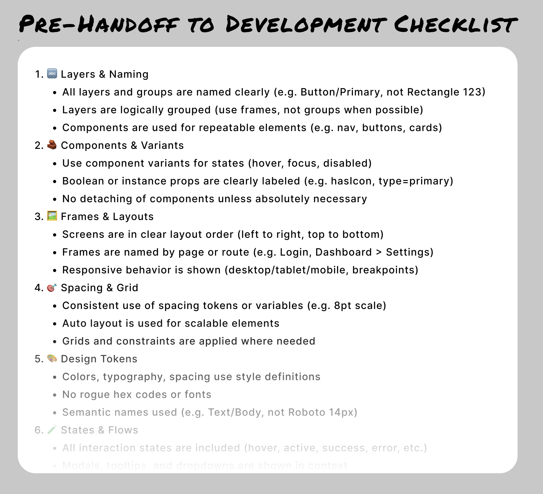
Pre-Handoff to Development Checklist
We use a Pre-Handoff to Development Checklist to ensure every design is production-ready before reaching engineering. It helps catch inconsistencies, improve component reuse, and clarify interactions.
AI as Code Co-Pilot
We used AI as a coding co-pilot throughout development, helping us write and refine code that aligned with Figma’s strict plugin guidelines. From structure to manifest setup, AI accelerated troubleshooting and ensured clean, standards-compliant implementation at every step.
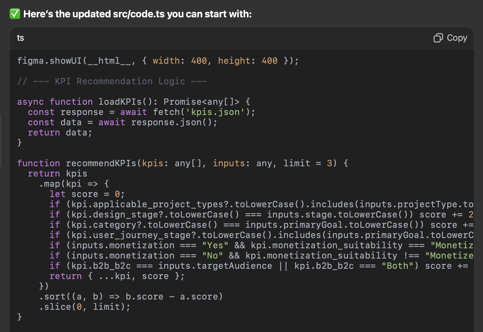
Writing Code with AI
We used Cursor with the latest Claude model to develop the product efficiently through conversational coding. By iterating directly in the editor, we are generating logic, refining components, and debugging issues in real time.
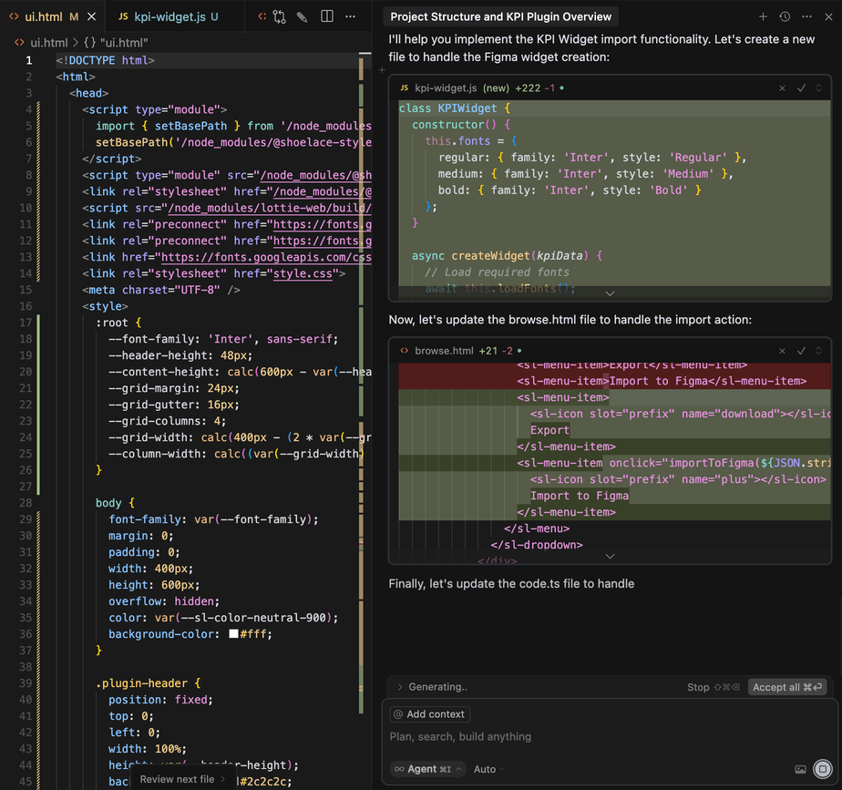
Technical Learnings
- Figma Plugins prefer SVG's over PNGs for security reasons.
- Code edits should be modular, but not so granular that they exceed the context limit or cause timeouts.
- Figma plugins can't load local CSS files via relative paths - they need to be bundled or inlined.
Our plugin is currently now in the development stage, stand by for more updates!
Selected Works
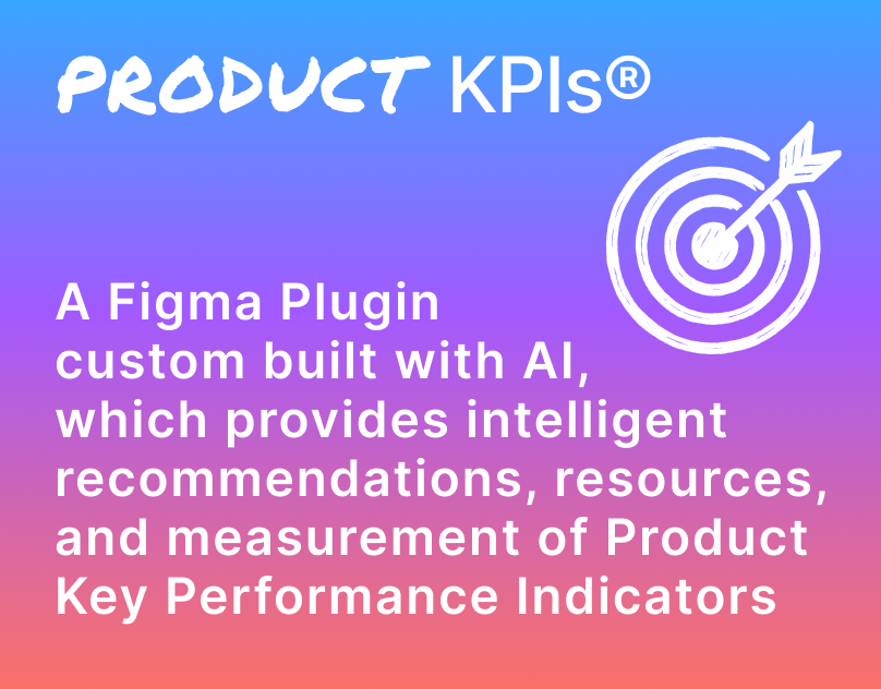
Product KPIsFigma Plugin
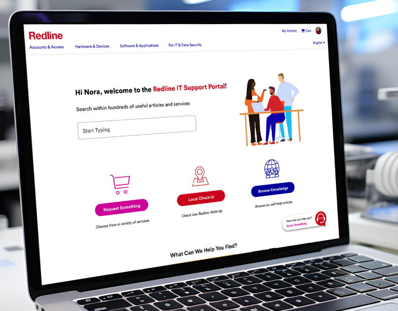
Redline IT Support PortalServiceNow IT Support Portal
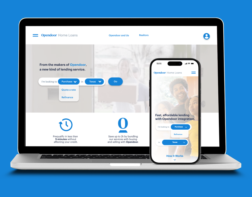
Opendoor Home Loans ExperienceUX Design
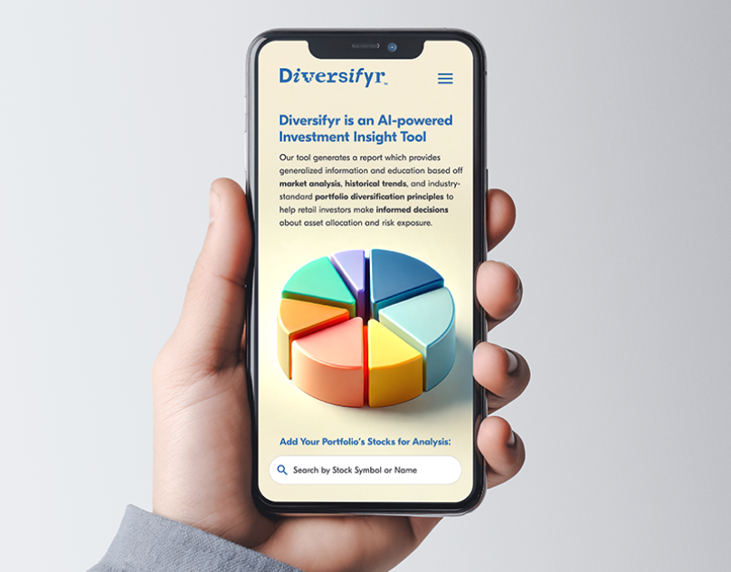
Diversifyr AI Fintech ToolFinTech
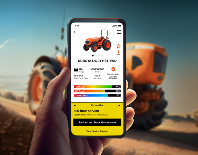
MyKubota Telemetric AppNative Mobile App Design
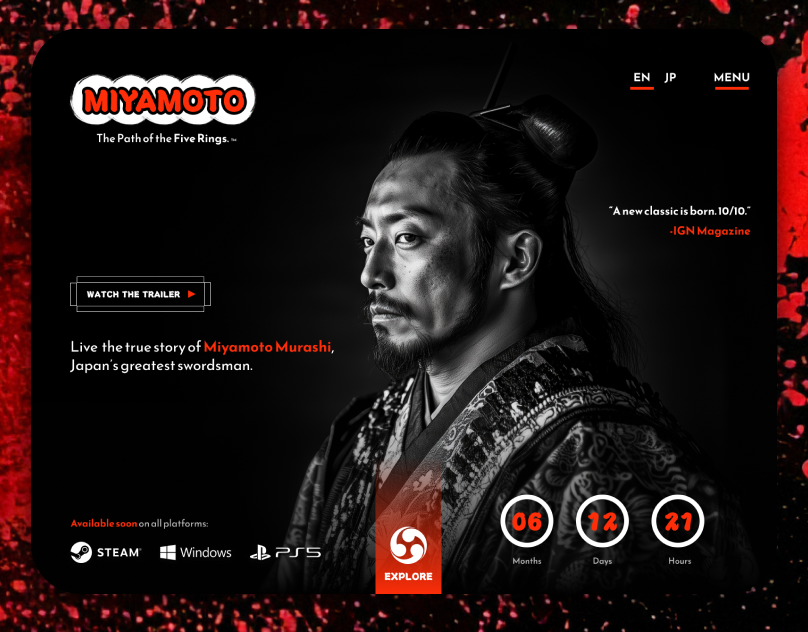
Miyamoto Video Game TeaserVideo Game Teaser Site
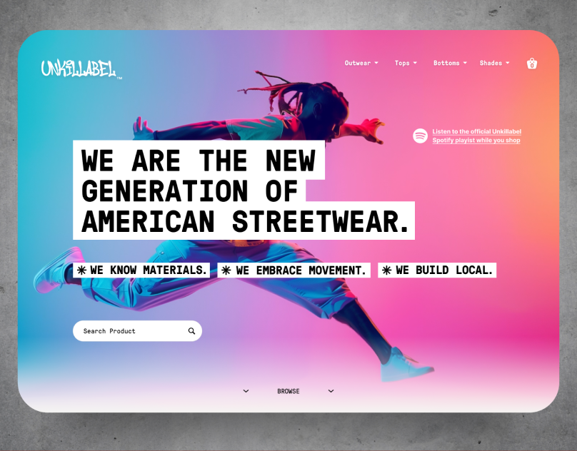
Unkillable Ecommerce ConceptRetail E-commerce